HEXYS Series

Hexys is a Hotel Front Desk Management System offers a cloud-based, user-friendly solution that minimizes training and human errors, enhancing guest engagement for mid-tier hotels, B&Bs, apartments, and clubhouses.

Business model

B2B

Role:

UX, UXR

Date:

2021

Industry:

Hotel Tech

Overview

Transforming Hotel Operations with Digital Solutions

Our team building HEXYS Series V1.0, I collaborated with a cross-functional team to enhance guest engagement for various accommodations. My focus was on aligning UX design with company objectives, streamlining user experience for both staff and guests.

tick icon
tick icon

40+ page

tick icon
tick icon

60% Design system coverage

Design Image
Design Image
Design Image
Design Image

57%

PMS providers to be average or poor.

34%

enhanced business intelligence features

58%

prioritize deeper technology integration

87%

expect a shift third-party APIs soon.

Problem Definition

The Critical Need for Unified PMS in Mid-Sized Hotels

icon
icon

Fragmented Systems

Mid-sized hotels grapple with inefficiencies and errors due to using disjointed systems for various management tasks without seamless data integration.

icon
icon

Limited Customization

Off-the-shelf PMS solutions often miss the mark for mid-sized hotels, being either too complex and costly or too basic, failing to meet their specific needs.

Collaborated with the PM in the early stages to define three phases of experience design.

01

Develop the MVP basic front desk management system.

Achieve an initial user adoption rate of 70%

02

Implement room category prediction functionality.

50% more feature use, 30% higher user satisfaction.

03

Enhance system and UI performance for personalized services.

40% better system efficiency, fewer user errors.

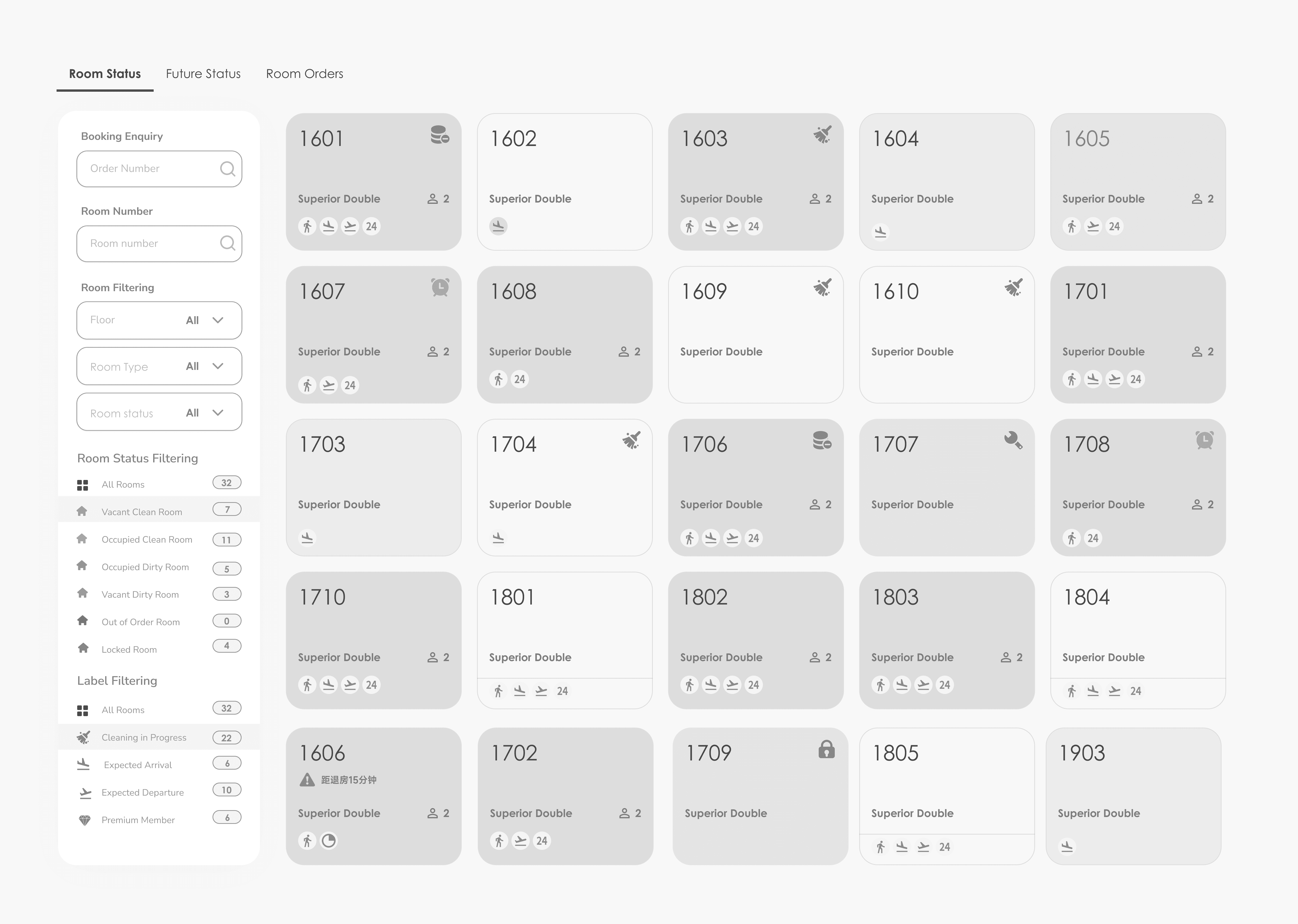
Phase One:Develop the MVP basic front desk management system.

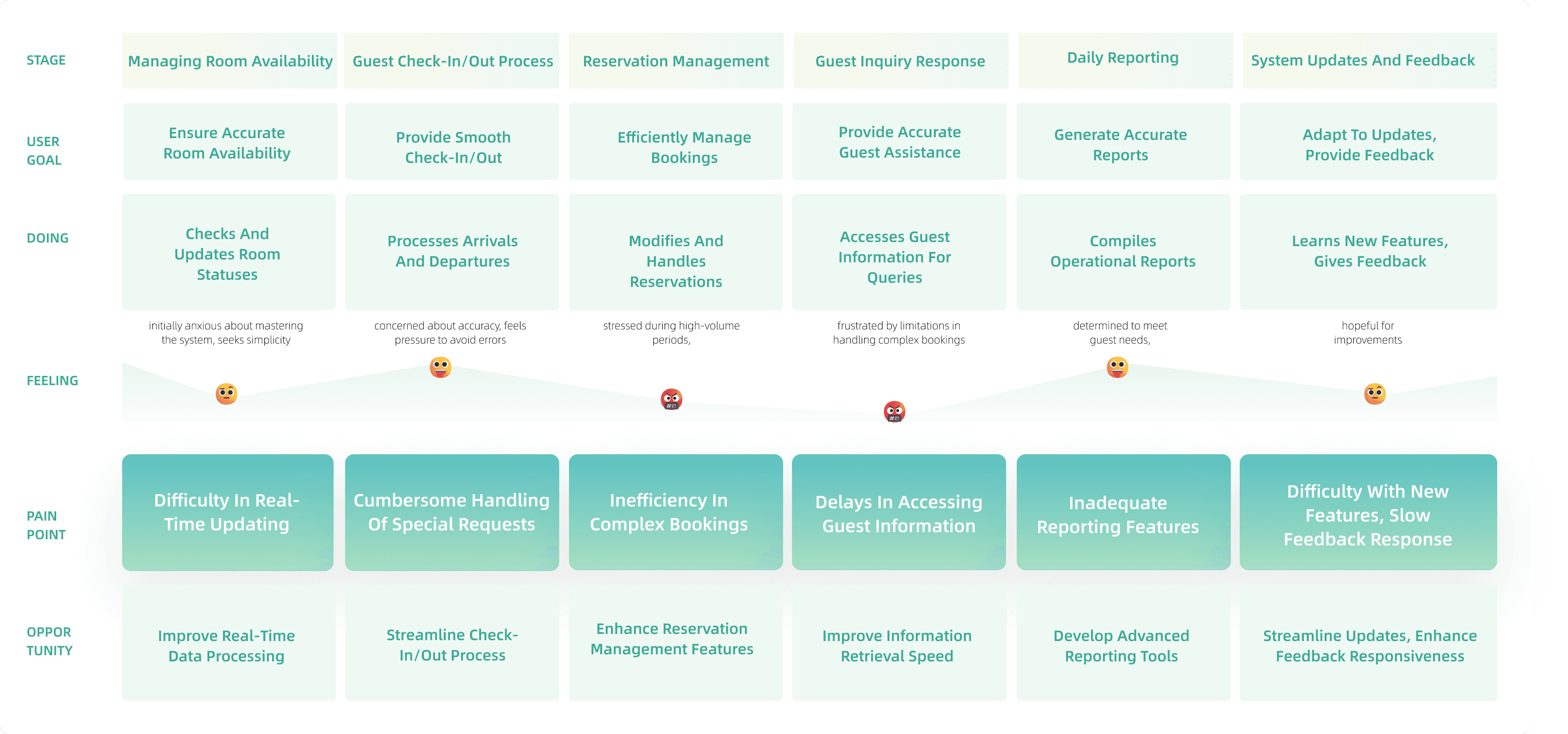
To understand every step a user takes when interacting with the system. This approach helps in identifying all possible scenarios, including typical daily tasks, exceptional cases, and user pain points. By mapping out these scenarios, the system can be designed to cater to a wide range of user needs and situations.

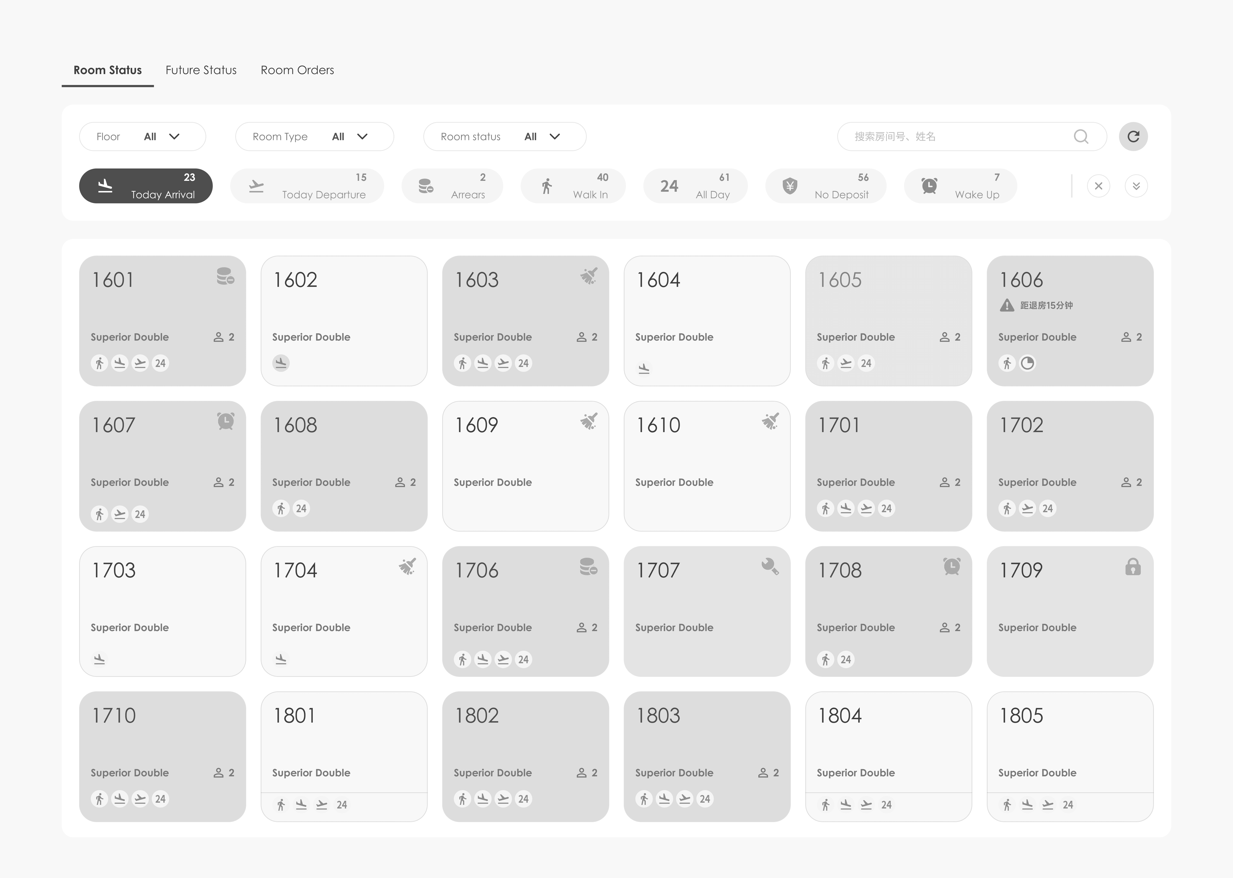
Collaborate with the PM to explore solutions.

In our solution exploration, we investigated two distinct approaches. This strategy was adopted to tackle user interface challenges from varied perspectives, ensuring a well-rounded evaluation and the selection of an approach that best aligns with user needs.
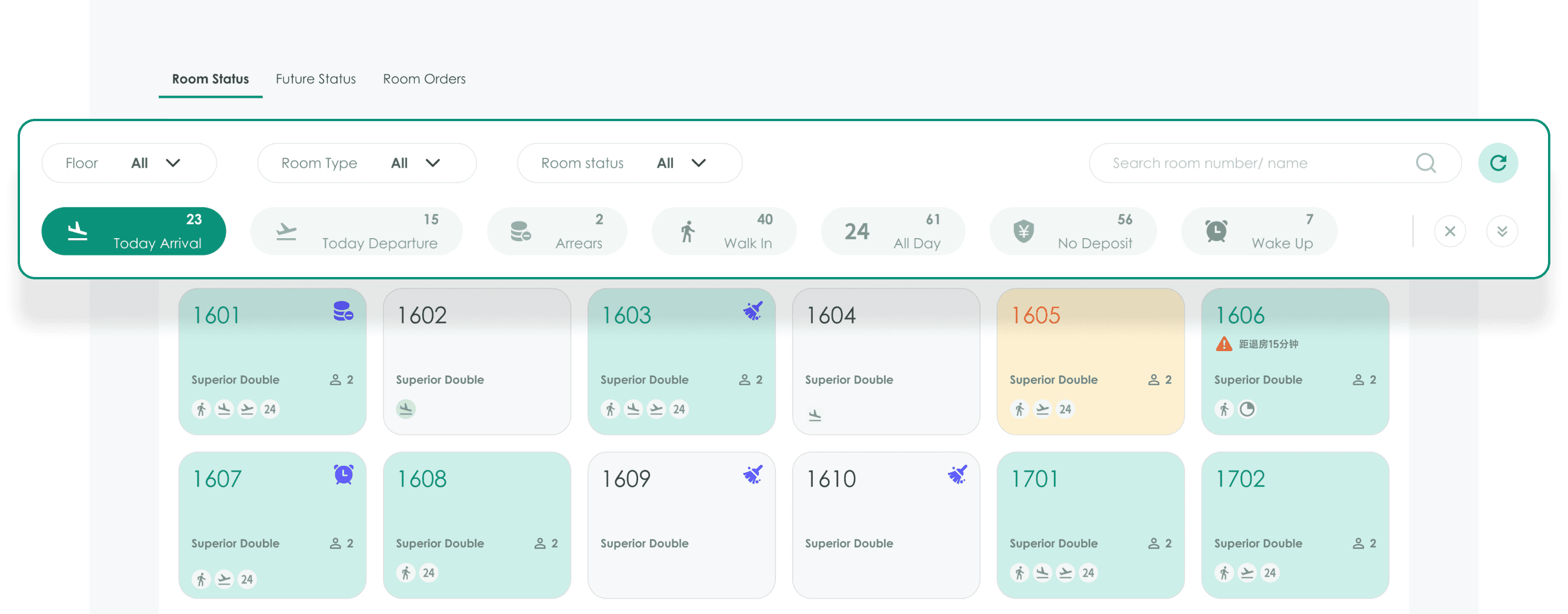
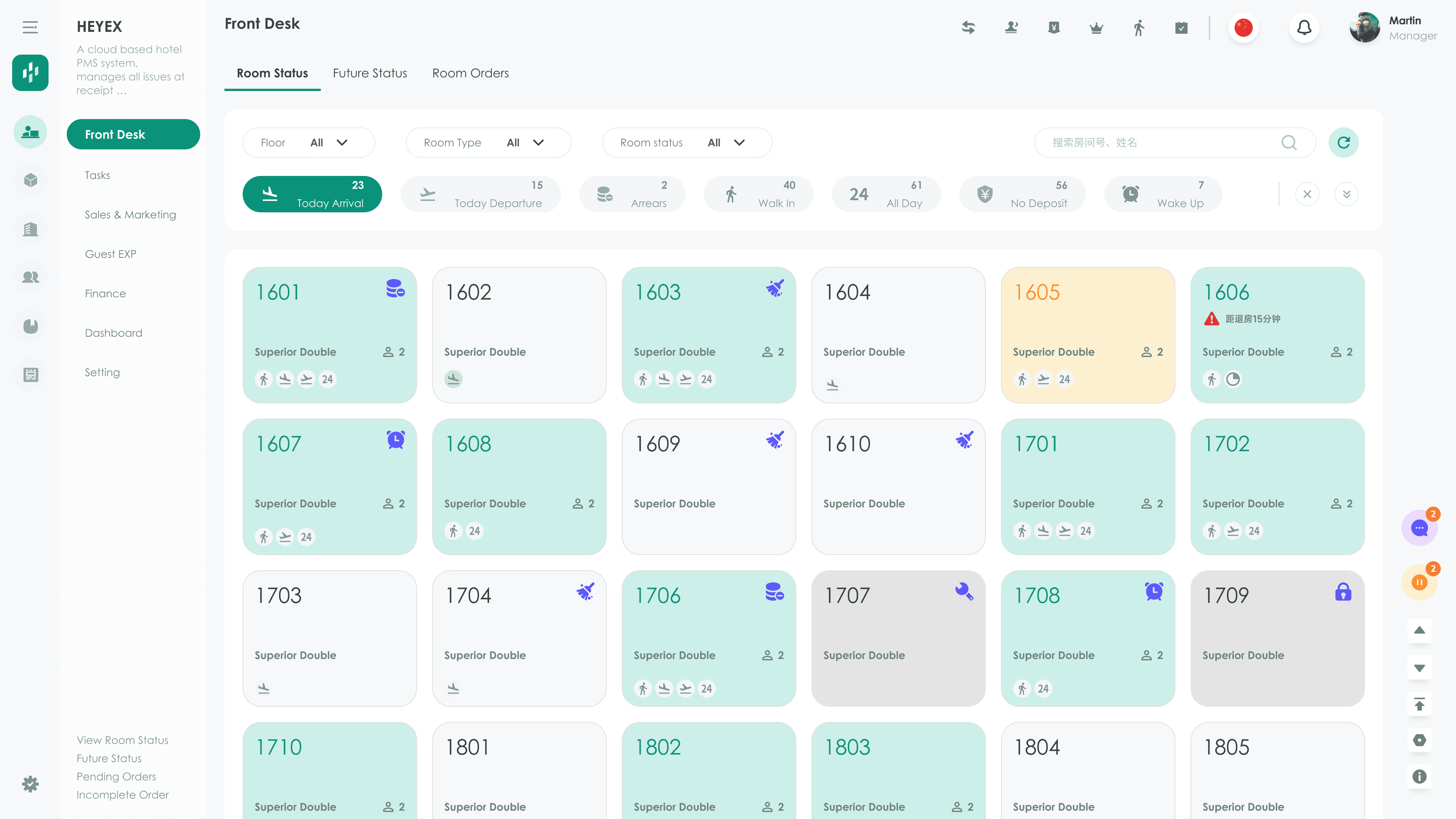
Advantages

Enhances visual clarity with a color-coded side filter form, making room status identification more intuitive.

Disadvantages

The multiple colors used might cause confusion, complicating the identification process.

Advantages

Offers quick access with a top-placed filter form and a larger viewing panel for efficient monitoring.

Disadvantage

The top placement can lead to frequent scrolling and reduced focus on filtering options during active use.

Plan A

Advantages

Enhances clarity by structuring the side filter form, thereby making the identification of room status more intuitive.

Disadvantages

The multiple colors used might cause confusion, complicating the identification process.

Plan B

Advantages

Offers quick access with a top-placed filter form and a larger viewing panel for efficient monitoring.

Disadvantages

The top placement can lead to frequent scrolling and reduced focus on filtering options during active use.

Advantages

Enhances visual clarity with a color-coded side filter form, making room status identification more intuitive.

Disadvantages

The multiple colors used might cause confusion, complicating the identification process.

Advantages

Offers quick access with a top-placed filter form and a larger viewing panel for efficient monitoring.

Disadvantages

The top placement can lead to frequent scrolling and reduced focus on filtering options during active use.

Solution

Streamlined Access and Interactive Real-Time Data Display

Enhanced Usability and Clarity": Plan B's design prioritizes easy navigation with clear labeling and intuitive layout, simplifying filter adjustments and enhancing overall user-friendliness.

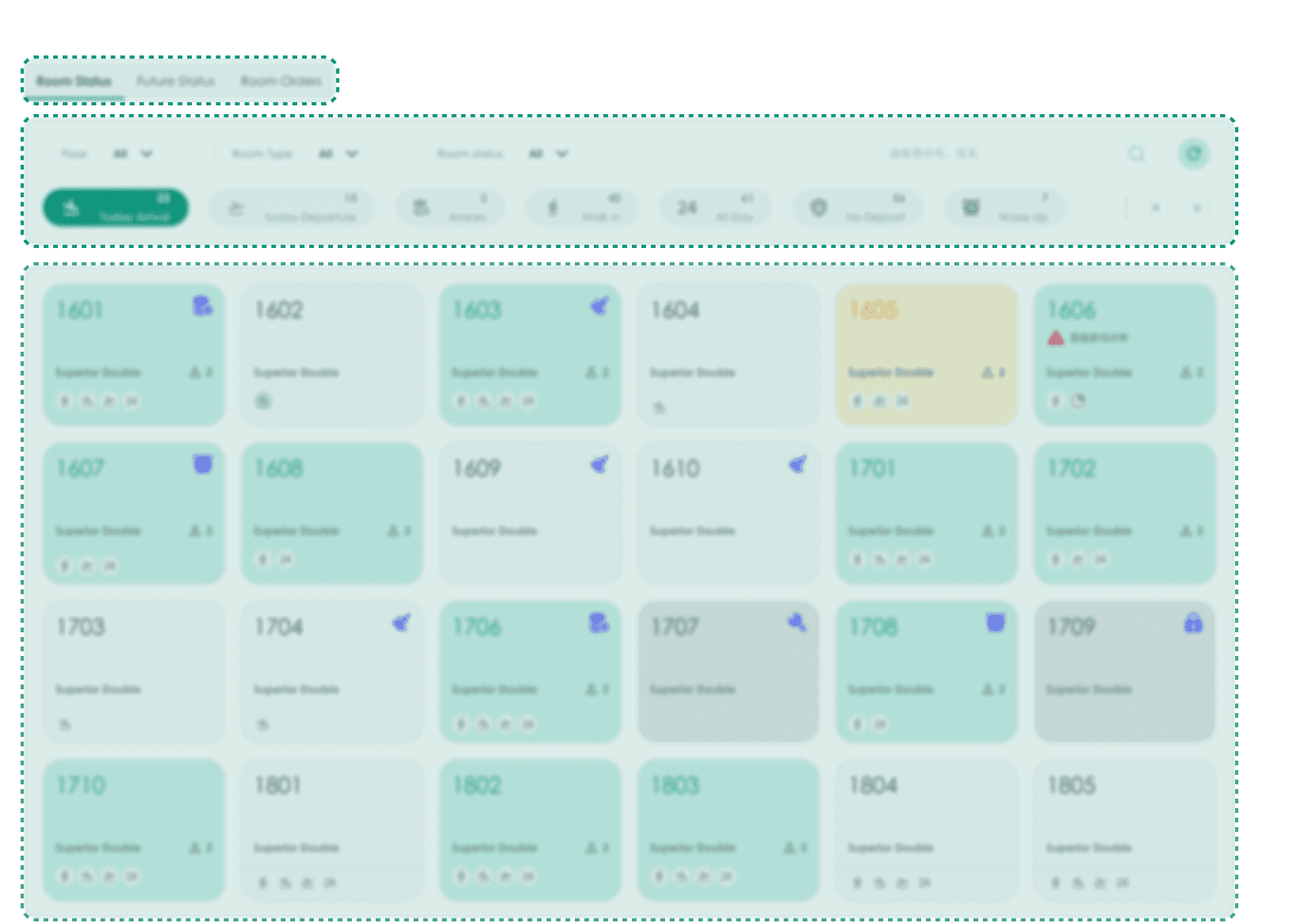
Simplified Layout and Reduced Cognitive Load.

Plan B's simplified layout eases decision-making and minimizes cognitive load, ensuring a smoother and more relaxed user experience.

Streamlining User Choices by Displaying High-Frequency Options.

Compared to Plan A, Plan B does not reduce the number of options but instead only displays a subset of commonly used, high-frequency options, eliminating distractions from other information. This approach facilitates quick decision-making for users by hiding complex or advanced features in deeper-level menus or settings

Let’s create your next big idea.

Let’s create your next big idea.

Let’s create your next big idea.